
Temple University Owl Mark Redesign
Branding | Entrepreneurship
Programs: Adobe Illustrator and Adobe Photoshop
Institution: Tyler School of Art and Architecture, Temple University
Art Direction: Bryan Satalino & Joe Bosack, Fall 2021
Team Members: Phillip Le & Hanna Lipski
The goal of this project was to create a new owl mark for Temple University that would reflect the university’s athletic traditions and legacy. The old one (now decommissioned) was designed in the ‘90s and was showing its age. My Senior Design Workshop class partnered with Joe Bosack, an alum of Tyler GAID and athletics brand designer extraordinaire, with redesigning and deploying a new identity system for Temple Athletics. This project allowed us to have the chance to leave our mark that would exemplify pride among the Temple community! Our clients were Temple Athletics and Temple's Strategic Marketing and Communications group. From ideation to refinement, and presenting our work to clients, the end result was selecting an owl that would go into full production applied all over the university for years to come.
Original Owl Mascot Logo
Brand Guidelines
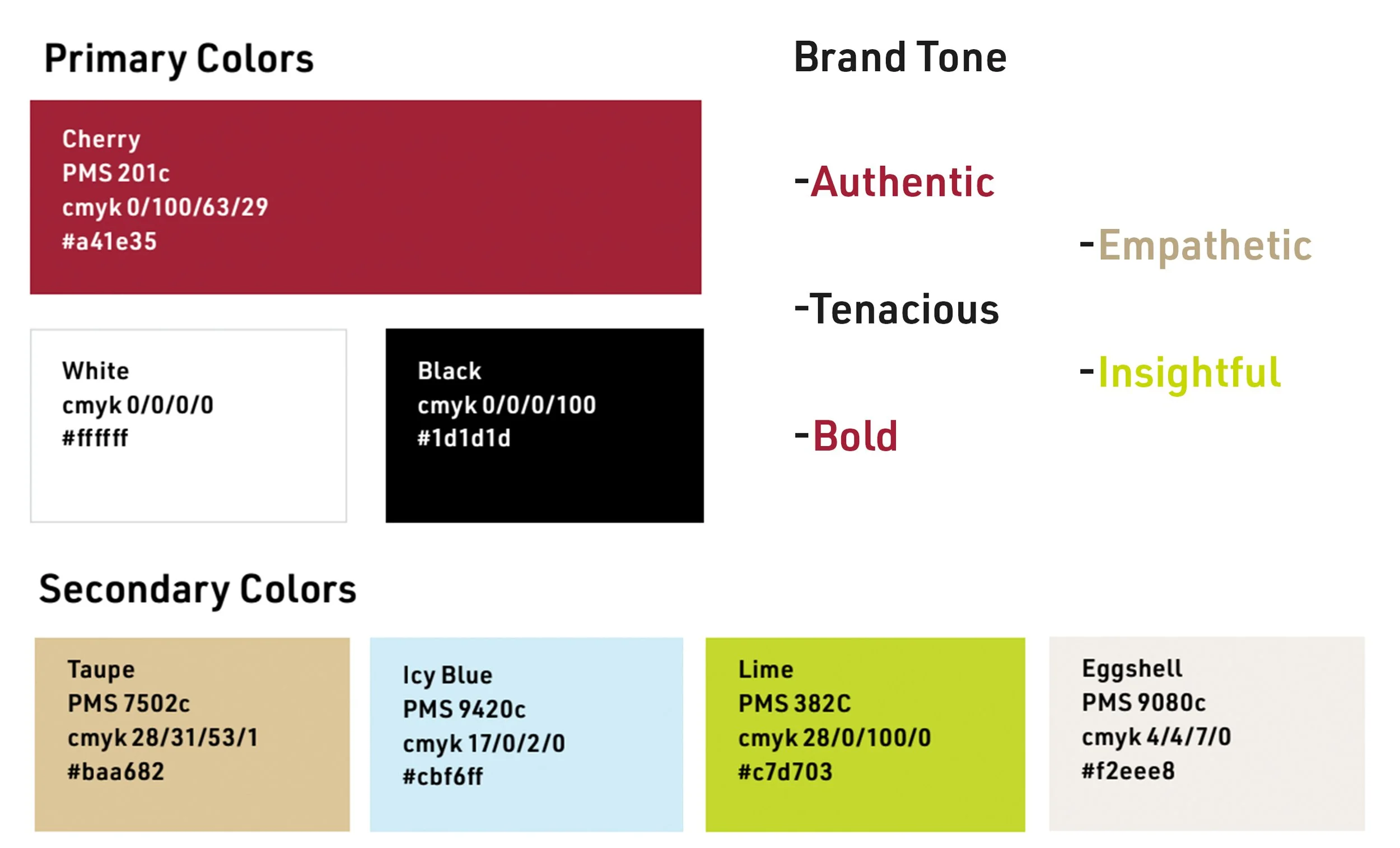
It was important to identify the overall voice/tone in order to discover the personality and attitude that we wanted to be reflected in the owl mark. The color palette was significant because the final design would be printed on a variety of applications such as online materials, on-campus facilities, fields and courts, as well as merchandising, apparel, and gear. On these applications, the mark must read clearly and adhere to Temple University’s brand guidelines. Another mandatory element was that the mark must be responsive, scalable, and resonate with a variety of age groups and audiences such as children, current students, and older alumni.
Brainstorming
During this phase, I wanted to get as many ideas as possible out onto paper. While sketching, I tried to explore how the Temple T could be combined with the owl in a memorable way. After my initial sketches, I thought it would be fun to play with the shape of the owl head and sketch in a more geometric style which led to the idea of the diamond-shaped head.

After the first critique, I gained insight from my classmates, professor, and Joe Bosack. Their initial thoughts focused on pushing the diamond and Temple T ideas further. When observing the work of my classmates and Joe, the idea of implementing the Temple bell tower, the heart of campus for more than 50 years, came up. In my own sketches for the second round, I attempted to sketch my own version also adding a subtle “T” and “U” in the head. I proceeded to digitize my sketches in Adobe Illustrator, constantly refining the edges and details.


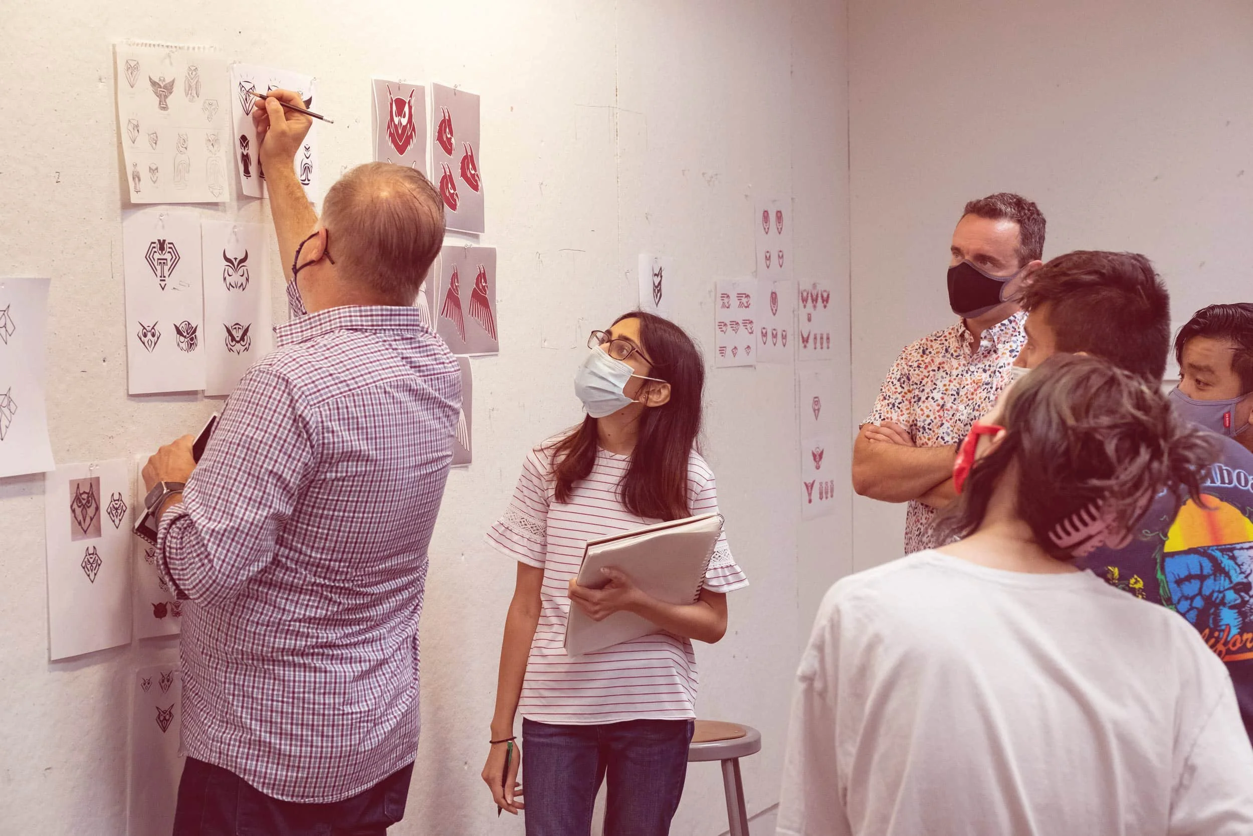
An in-class critique on the digitized versions of my sketches. Some notable feedback was to work with simpler lines and crisper shapes. The eyes of my owls needed to feel less shiny and more aggressive, have more of a self-containing shape overall, and include more hard edges experimenting with different shapes. Photo Credit: Joseph V. Labolito
Experimenting
I followed the suggestion of working with different shapes and sharper, more bolder edges. With the diamond idea in mind, I explored how the owl could fit within a diamond self-contained shape. My professor advised me to focus on the eyes and how adding a simple triangle in the corners could add an aggressive glint to the look of the owl.


Observing
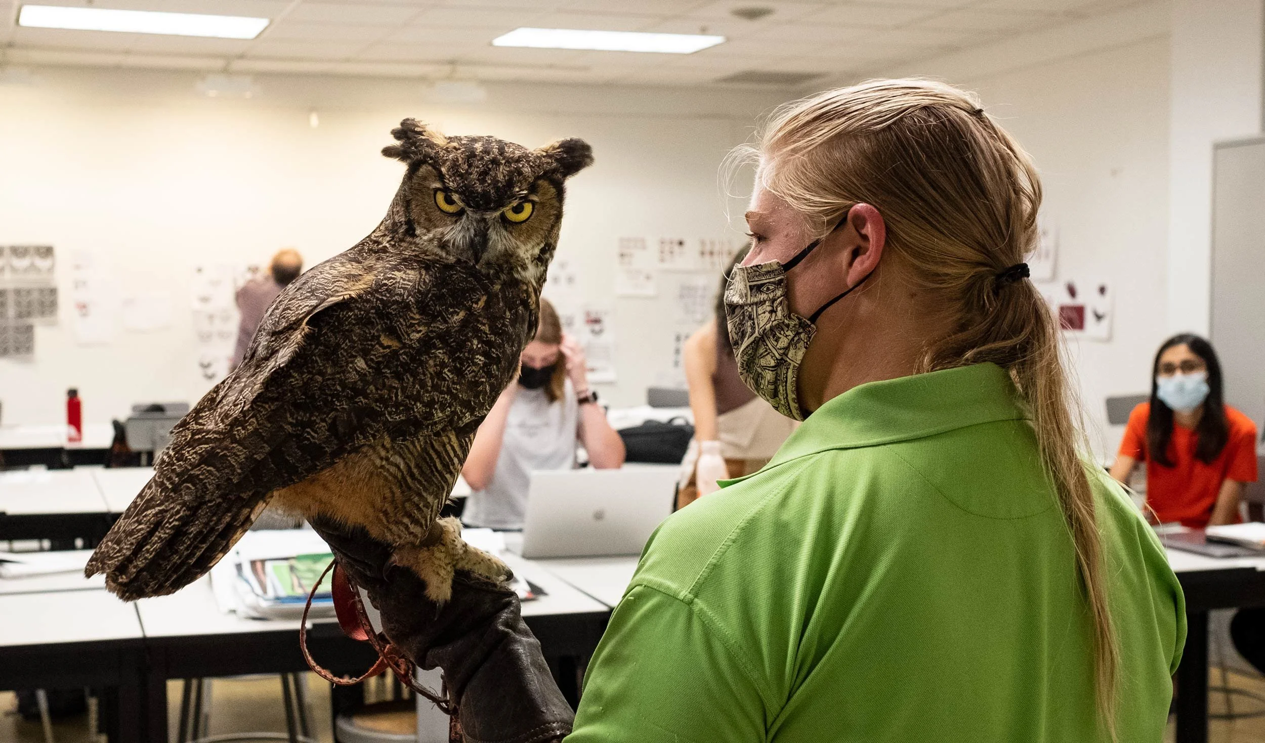
One of the most memorable moments during this process was when Stella, the great horned owl and mascot of Temple, came to visit our class from the Elmwood Park Zoo. Getting the opportunity to observe, capture, and sketch her from up-close was an honor. This helped our class get a sharper idea of the anatomical features of an owl.


I continued to refine and focus on this concept, trying to simplify the shapes down. Through experimentation, I created different wing shapes, sizes, and curves. One challenge was getting the point of the head to fit into the body in a seamless way. Overtime, I made the head thinner, pointier, and removed extra shapes. Ultimately, I landed on the starred concepts!

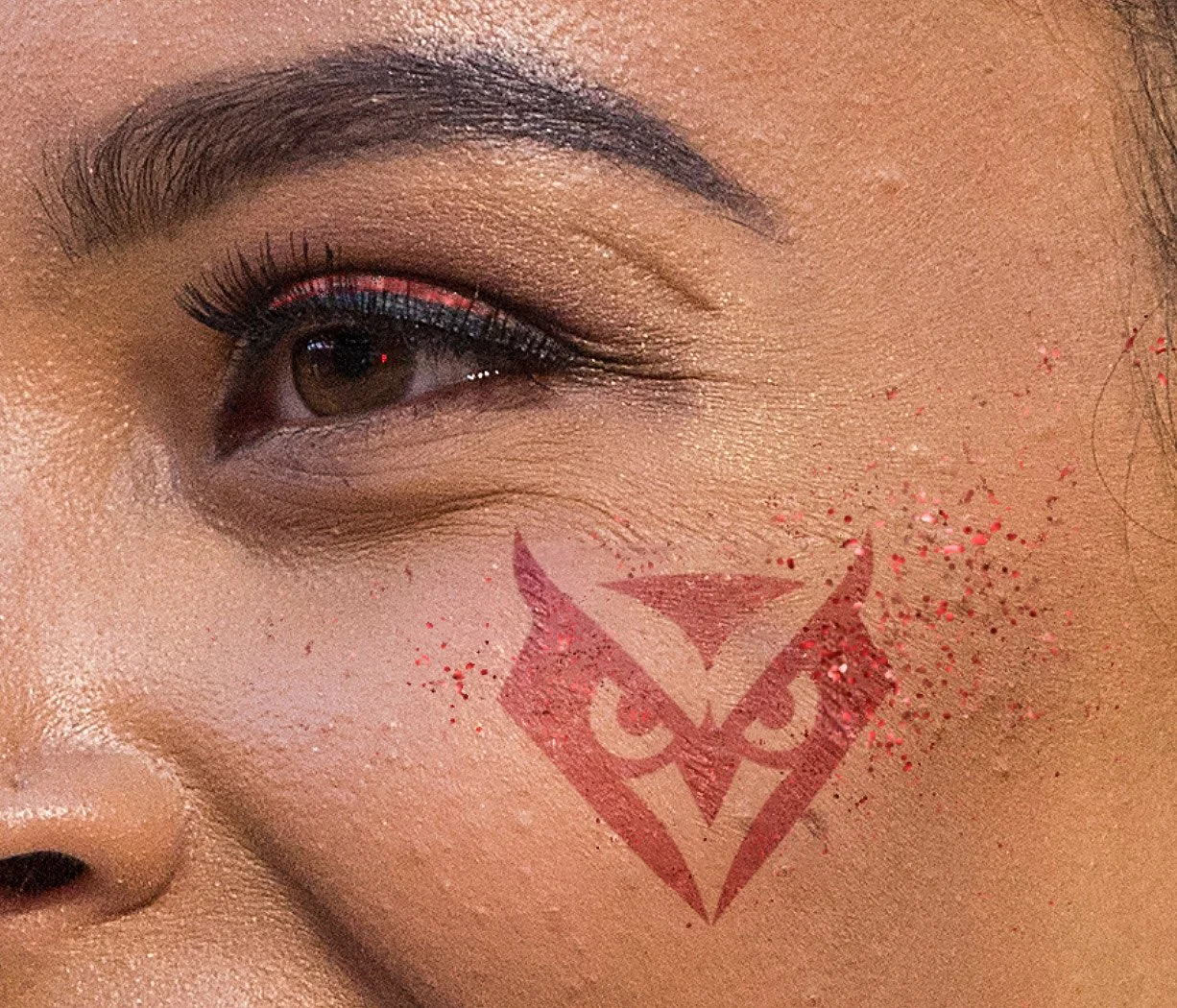
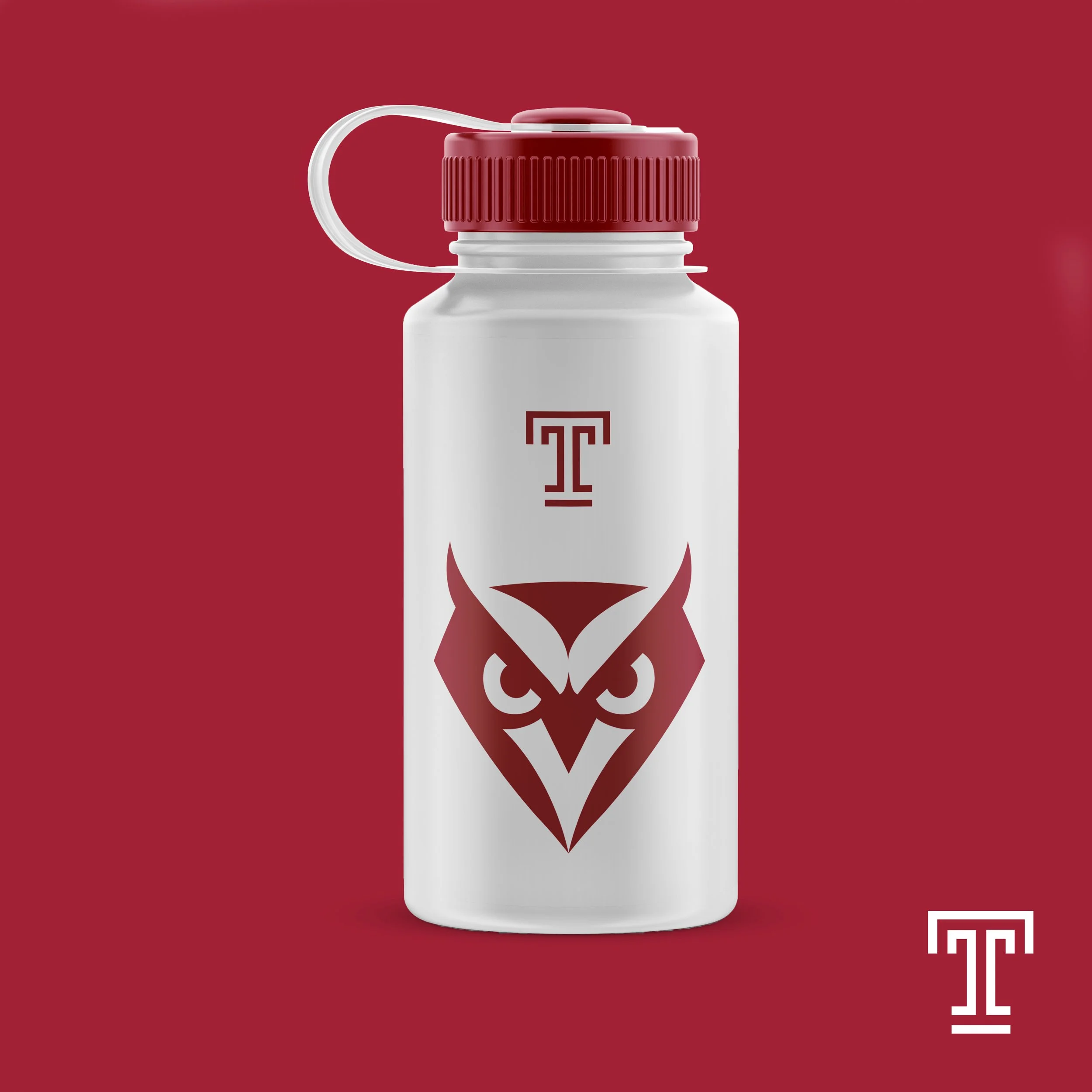
My final solution, an owl head and the full body version. The idea behind my designs was to combine the shape of a diamond with the owl. Diamonds are significant to the university and have a long history dating back to the Acres of Diamonds speech by Russell Conwell, the founder of Temple University. He emphasized that “opportunity lurks in everyone’s backyards.”
Proposed Applications
The final owl mark I proposed can be seen on a wide range of Temple merchandise, athletic gear, and on campus.


Takeaways
This collaborative experience has been one of a kind and a memorable way to end my last year at Temple University. Being a part of something bigger than myself allowed me to learn the behind the scenes process of design, partnerships, and meeting the needs of clientele. Getting the opportunity to work alongside my talented classmates, professor, and Joe Bosack was an honor. I got to be a part of a real world project and see its applications, refine my work based on received feedback, sit in on focus groups and hear the different perspectives from past Temple alumni, staff, students, and clients. All of these moments enriched my work and reminded me of how striking the owl as a mascot truly is to the entire Temple community and beyond.
