Process Magazine
Typography | Publishing Design | Layout
Programs: Adobe InDesign, Adobe Illustrator, and Procreate
Institution: Tyler School of Art and Architecture, Temple University
Art Direction: Dermot Mac Cormack, Fall 2021
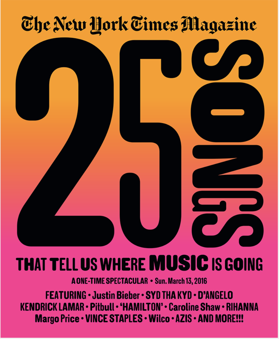
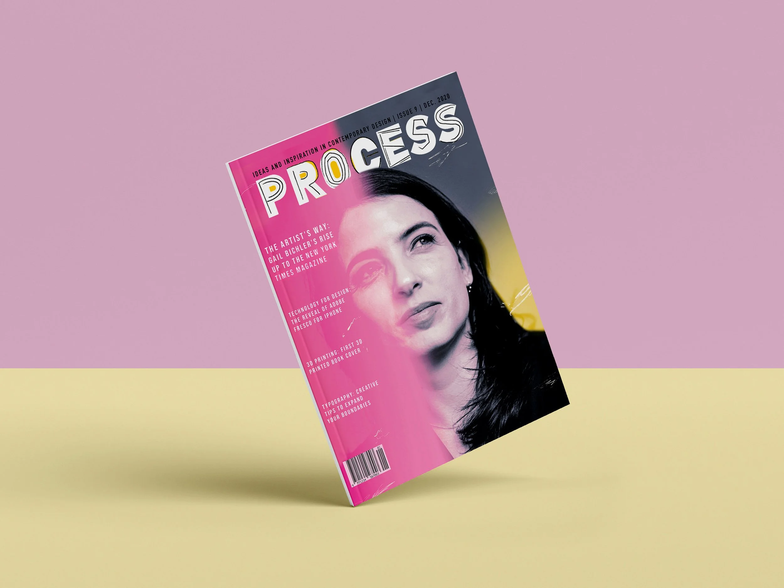
The Process Magazine project focuses on implementing typographic hierarchy, utilizing grids to create eye-catching compositions, and keeping a consistency by using common practices for editing. The project, assigned in my junior typography class, was to create a cover, contents, and featured spreads that related to a chosen designer. I chose the contemporary designer, Gail Bichler, the Design Director at the New York Times Magazine. Her modern, bold, and colorful work inspired me to create a magazine based on her process and style.
Inspiration
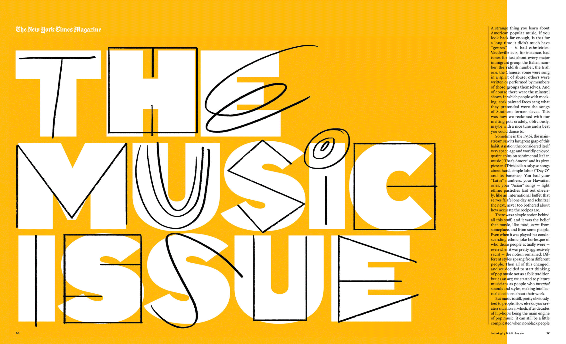
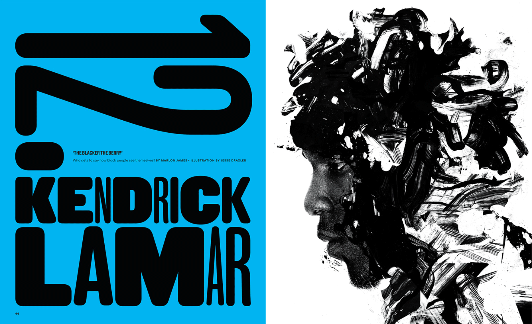
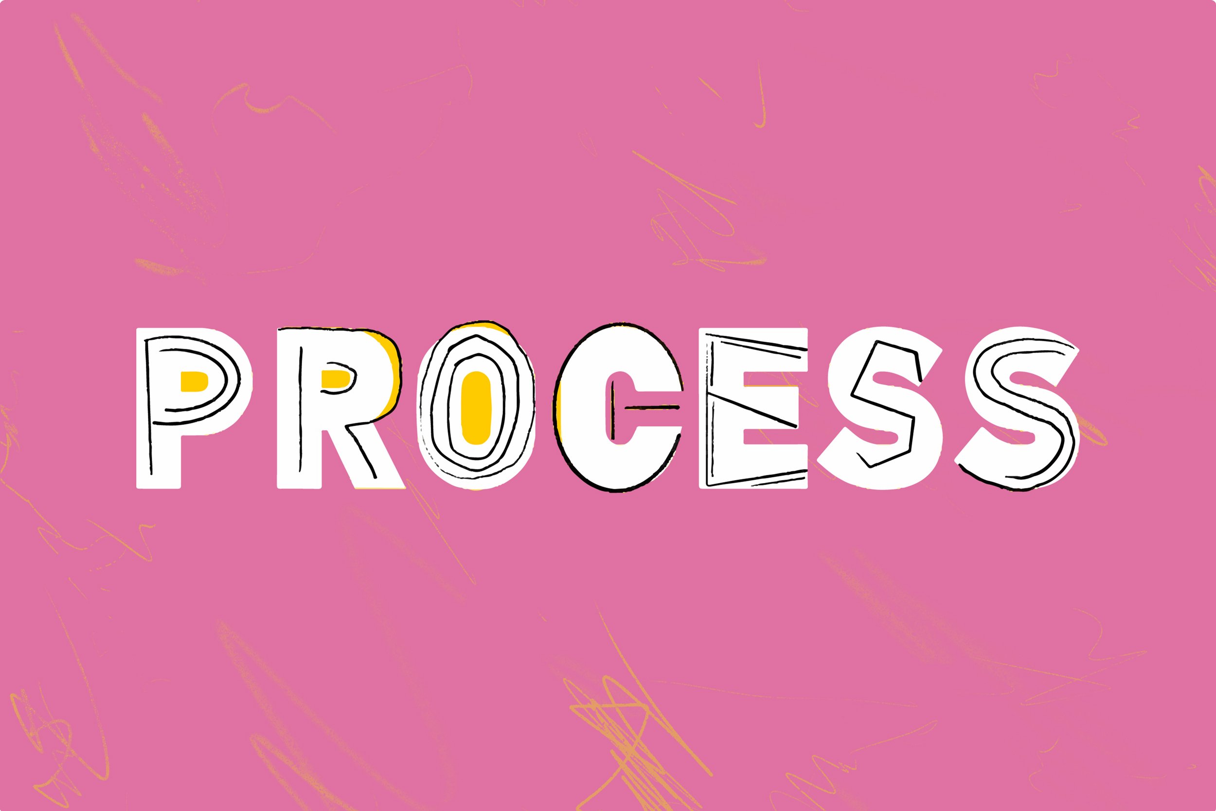
I find editorial illustrations intriguing because there is magic in creating a smart and striking design subtly and under time pressure. Gail Bichler had to undergo many time constraints from a Designer and worked her way up to lead the different teams of the publication. When researching, I found that her work for the magazine was more stripped down and took advantage of the white space. Her typography was visually interesting, varying in widths, weights, and sizes. I wanted to emulate this style throughout the magazine. Specifically, in “THE MUSIC ISSUE,” the style of type is layered with big bold letters and on top, is a more loose and sketchy version of the letters. I resonated with this and thought this literally showed a process, hence the title of our magazines.
Sketches
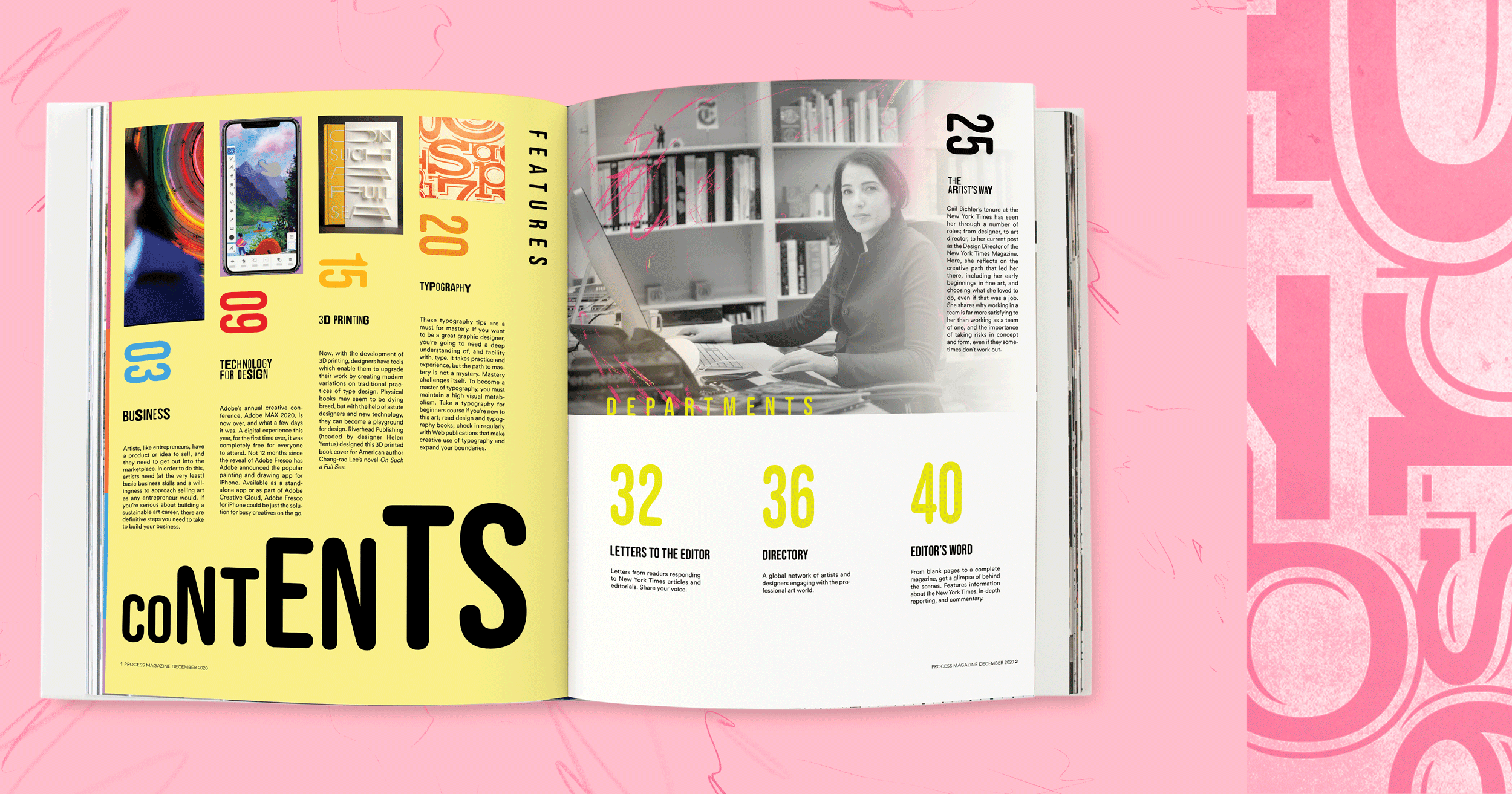
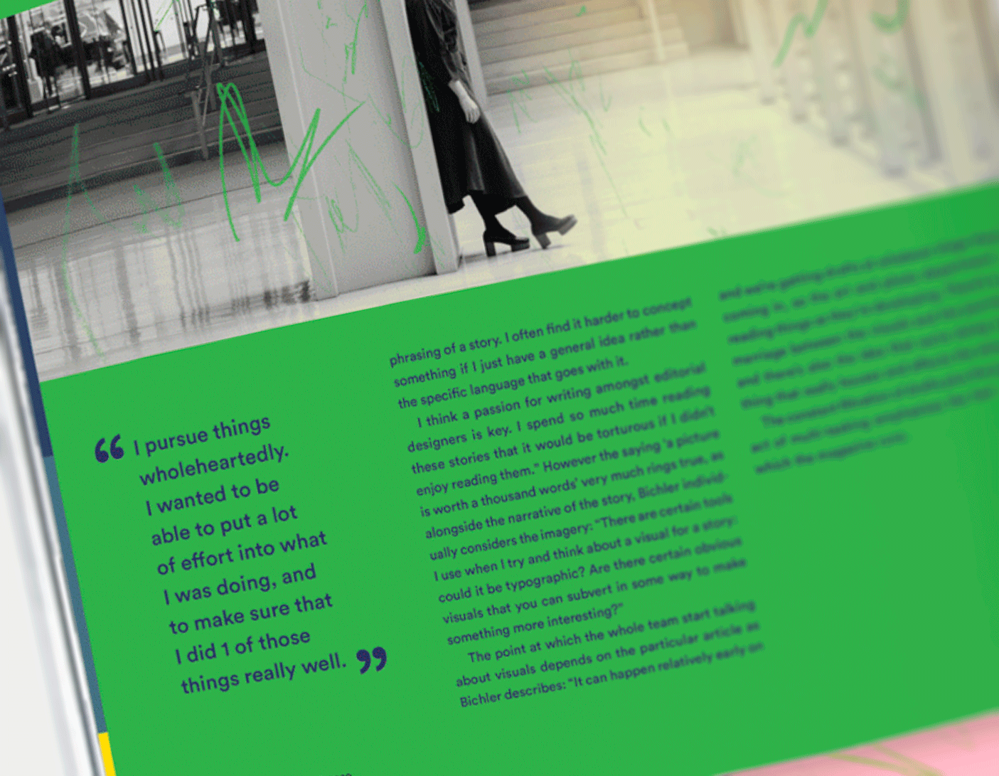
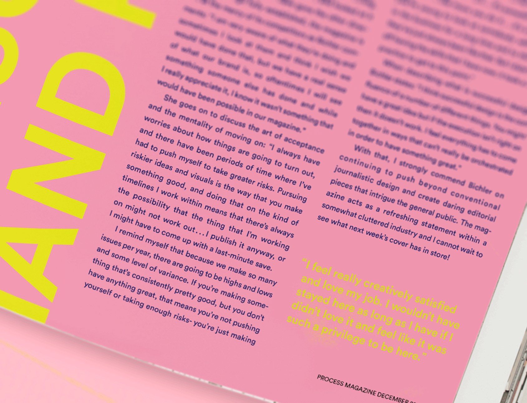
Working in InDesign, I incorporated black and white images of her with sketchy pops of color and color gradients to create a strong contrast. For the table of contents, I sectioned the page into four sections with the word “Contents” gradually growing to new heights. Color and typography were my top priorities as I explored interesting ways of portraying the information about her.
TABLE OF CONTENTS
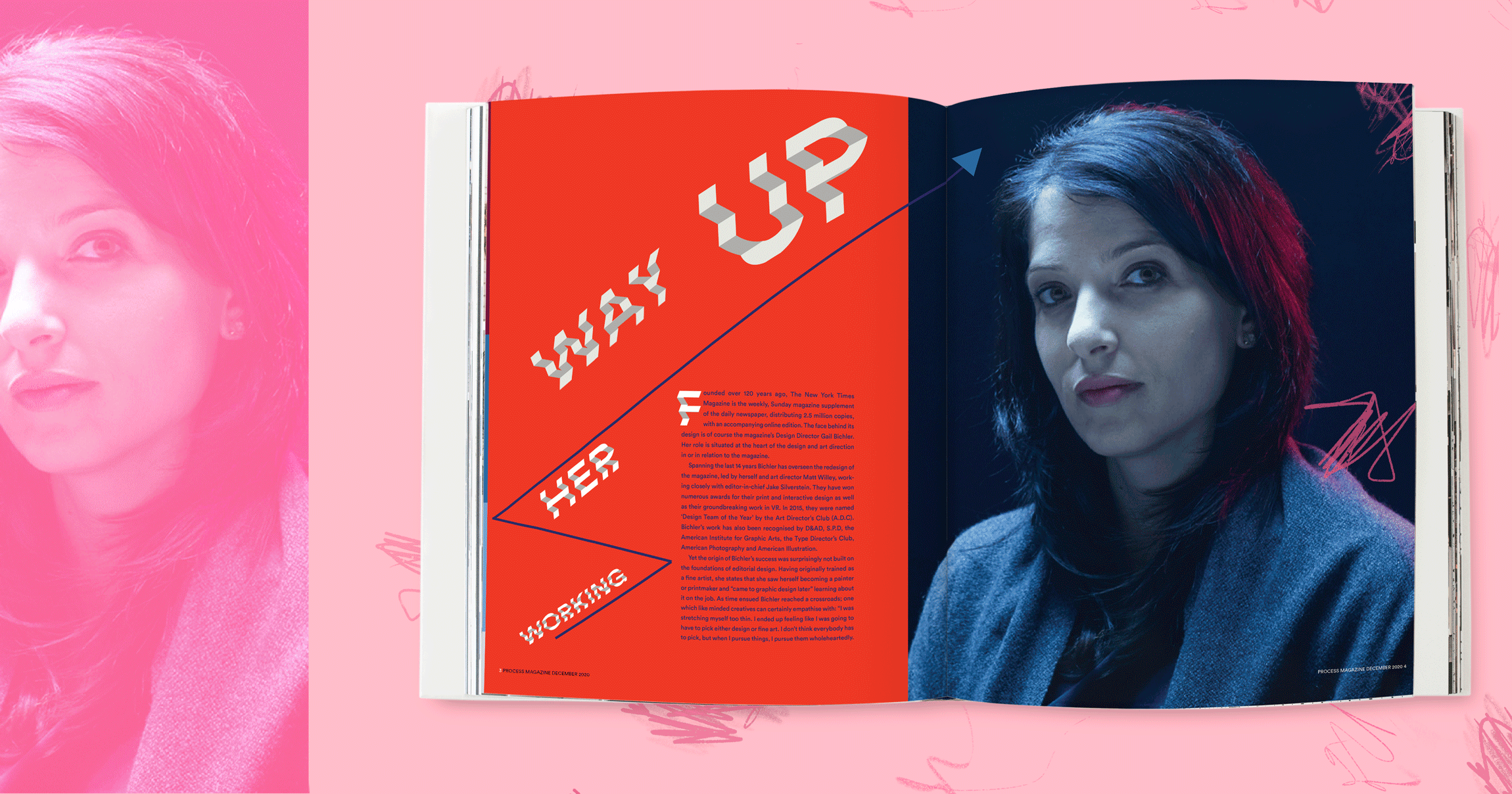
SPREAD 2
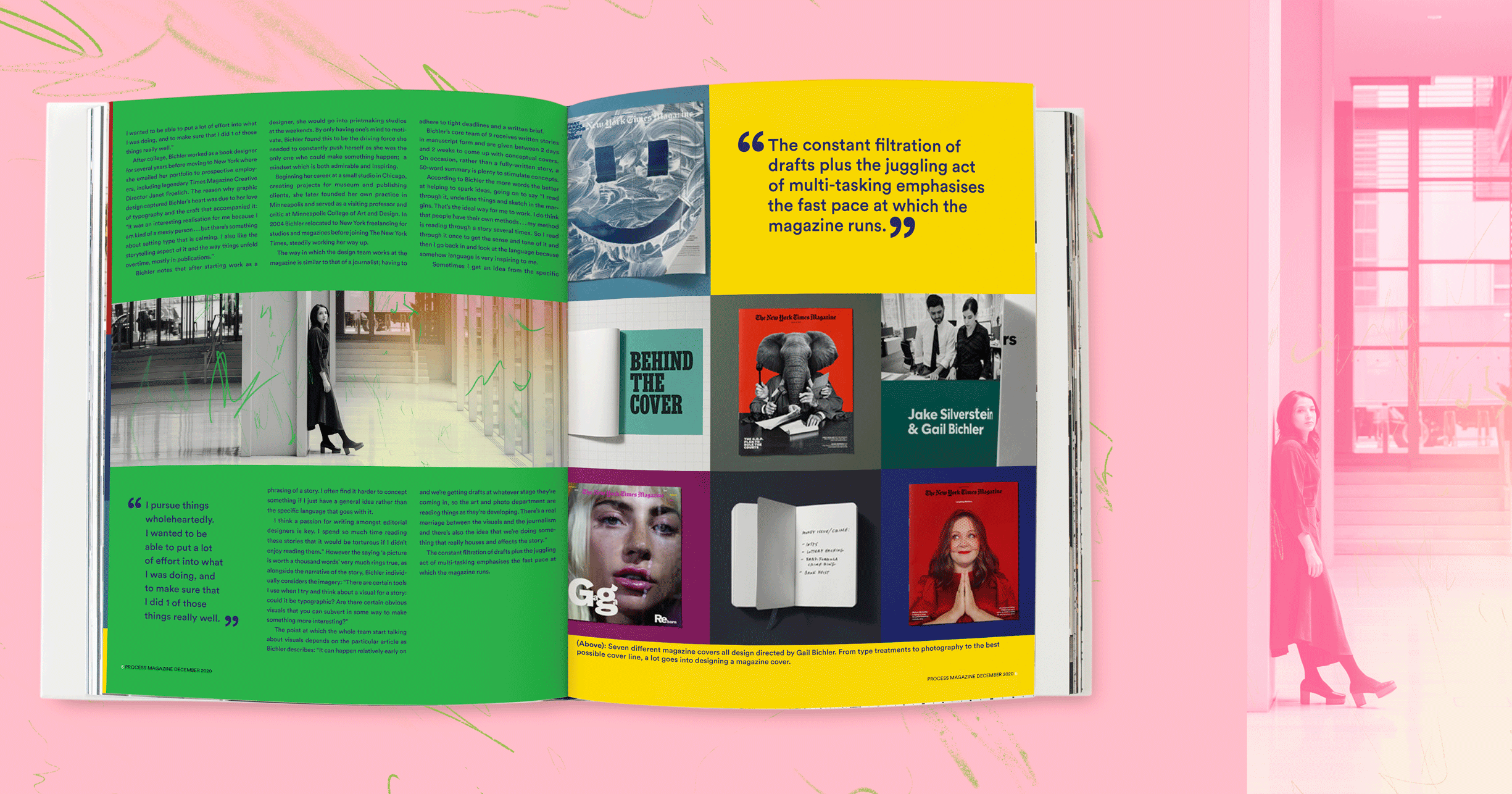
SPREAD 3
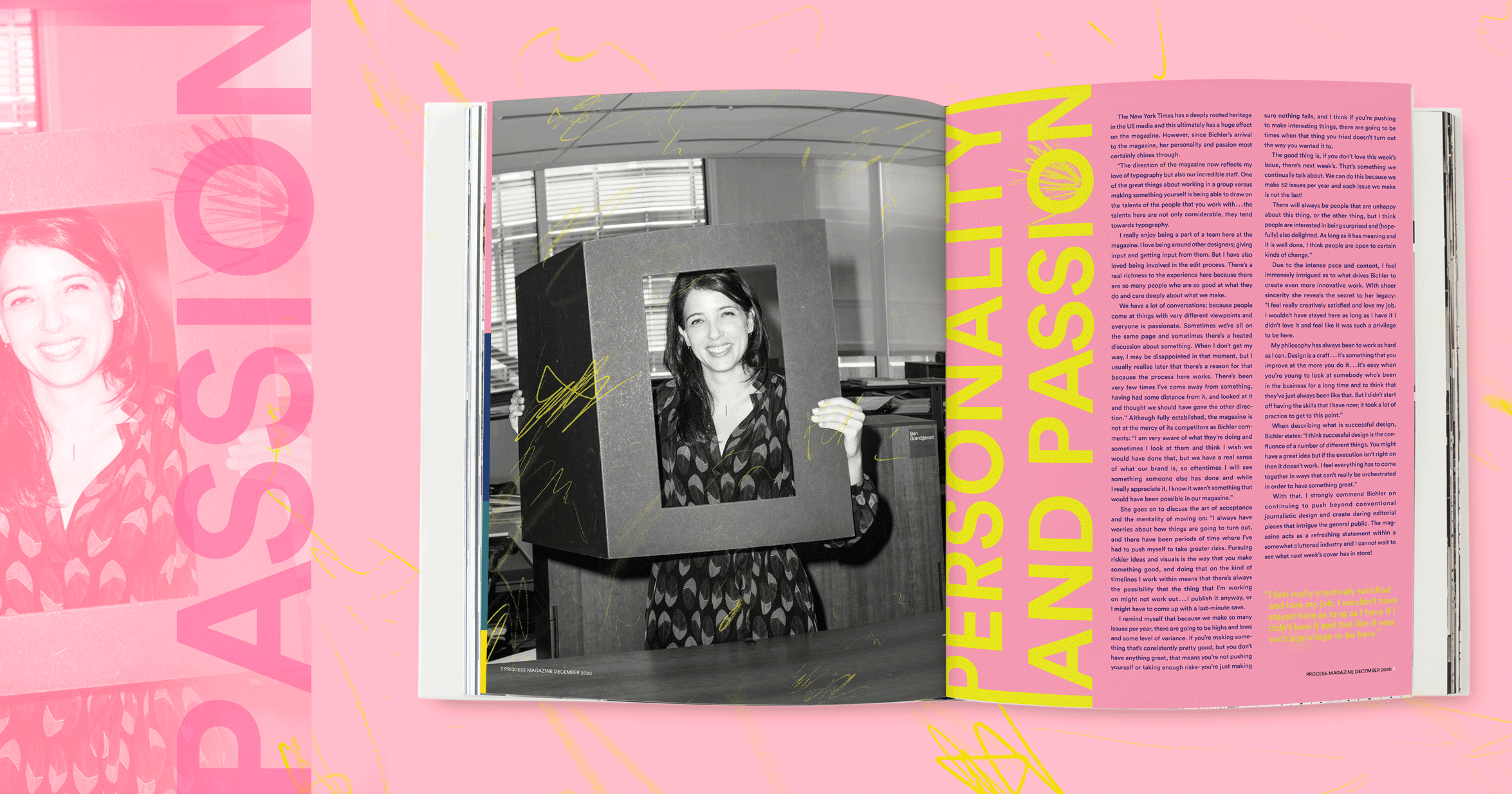
SPREAD 4
The Finer Details

Takeaways
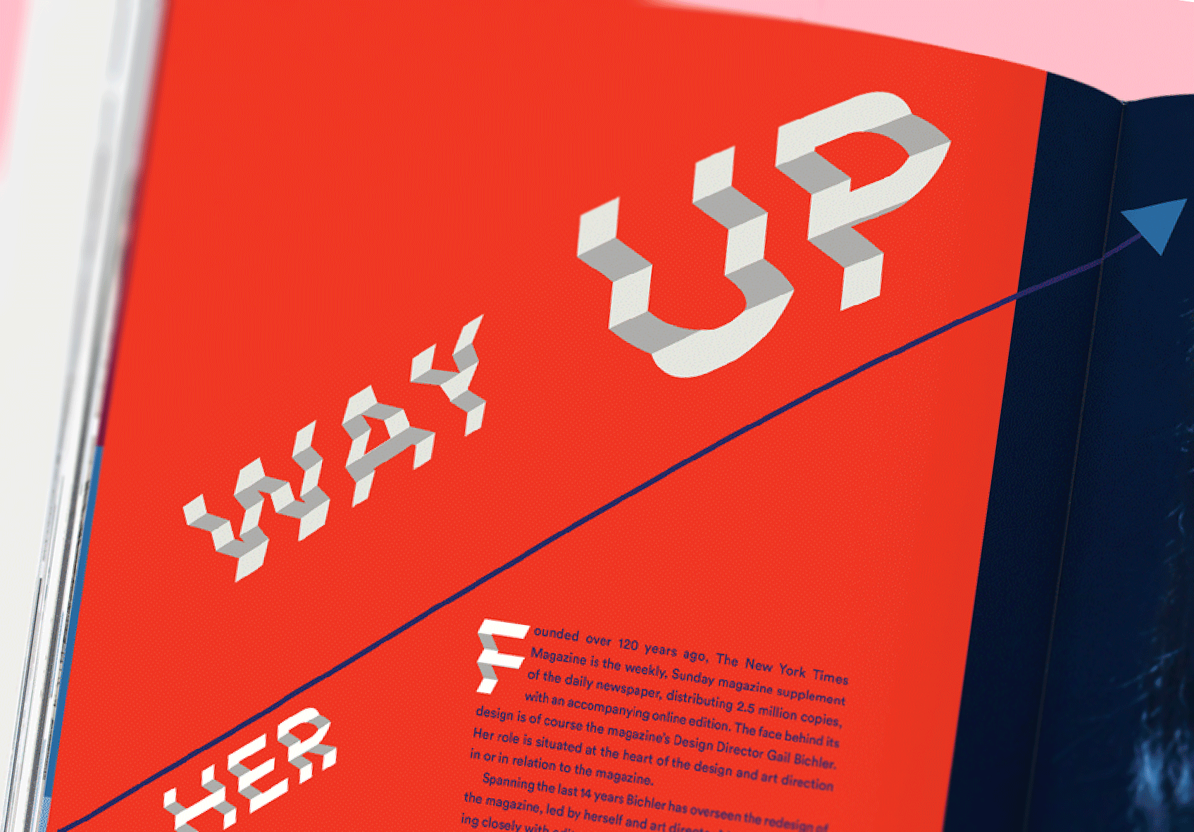
Overall, my favorite part of the process was exploring the treatment of the images to feel like Bichler’s style, but having a balance with my own creative touch. One challenge I faced was creating the type that could express how she worked her way up in the company. I looked at different tutorials and was able to create a stepped stairs effect found in Spread 2. In the process, I was fortunate to explore typography, image making, and learned a lot about Gail Bichler as a person and designer.

